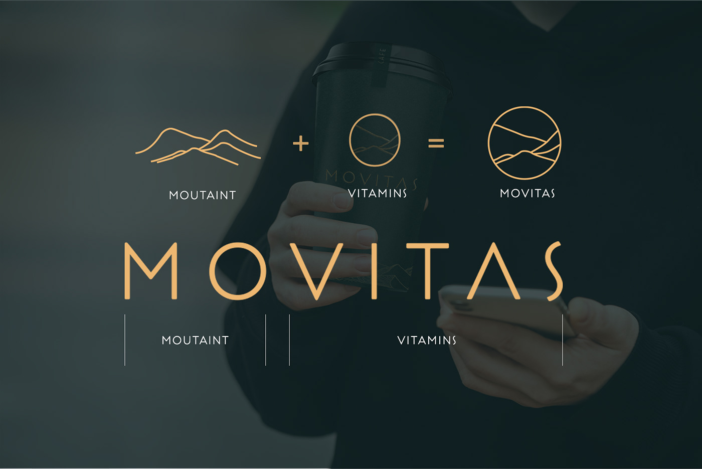
MOVITAS
The Movitas logo embodies the essence of vitality, drawing inspiration from the majestic mountains and the nourishing power of vitamins. At the forefront of the design is a rugged mountain peak, standing tall and firm, symbolizing strength, resilience, and endurance. The mountain is depicted with sharp, defined edges, conveying a sense of fortitude and determination.
Interwoven within the mountain contours are subtle representations of vitamin molecules, intricately integrated to signify the core focus of Movitas on delivering health and wellness through natural elements. These vitamin motifs are seamlessly blended into the overall design, emphasizing the brand's commitment to harnessing the potency of nature for positive well-being.


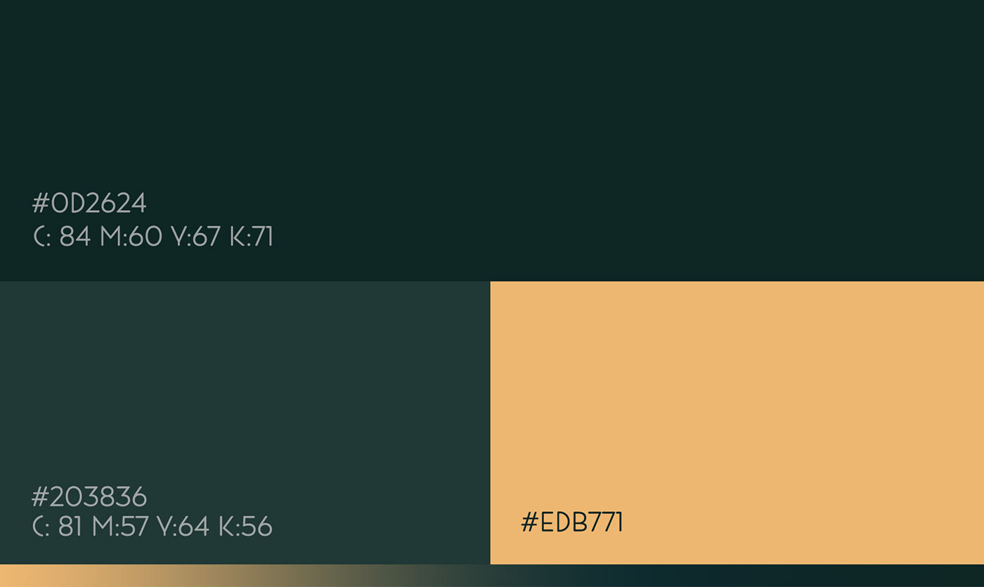
The color palette chosen for the logo reflects the rich hues found in the mountainous terrain – deep earthy tones of greens and browns, evoking a sense of groundedness and vitality. Splashes of vibrant colors, reminiscent of fresh fruits and vegetables abundant in essential vitamins, are strategically incorporated to add vibrancy and energy to the design.
Overall, the Movitas logo exudes a sense of rugged strength, vitality, and positivity, serving as a visual representation of the brand's mission to empower individuals to embrace a healthier, more robust lifestyle through the natural goodness of mountain-inspired vitamins.